


















7个月前发布461次阅读




隐藏搜索图标
电脑端 移动端 只能改成这样了 空间不足
 移动端 只能改成这样了 空间不足

9个月前更新428次阅读
 推广会员及以上会员






给你改了个放在func文件里面的直接插入短代码使用,更简洁
效果图
后台编辑直接替换短代码中间文字即可
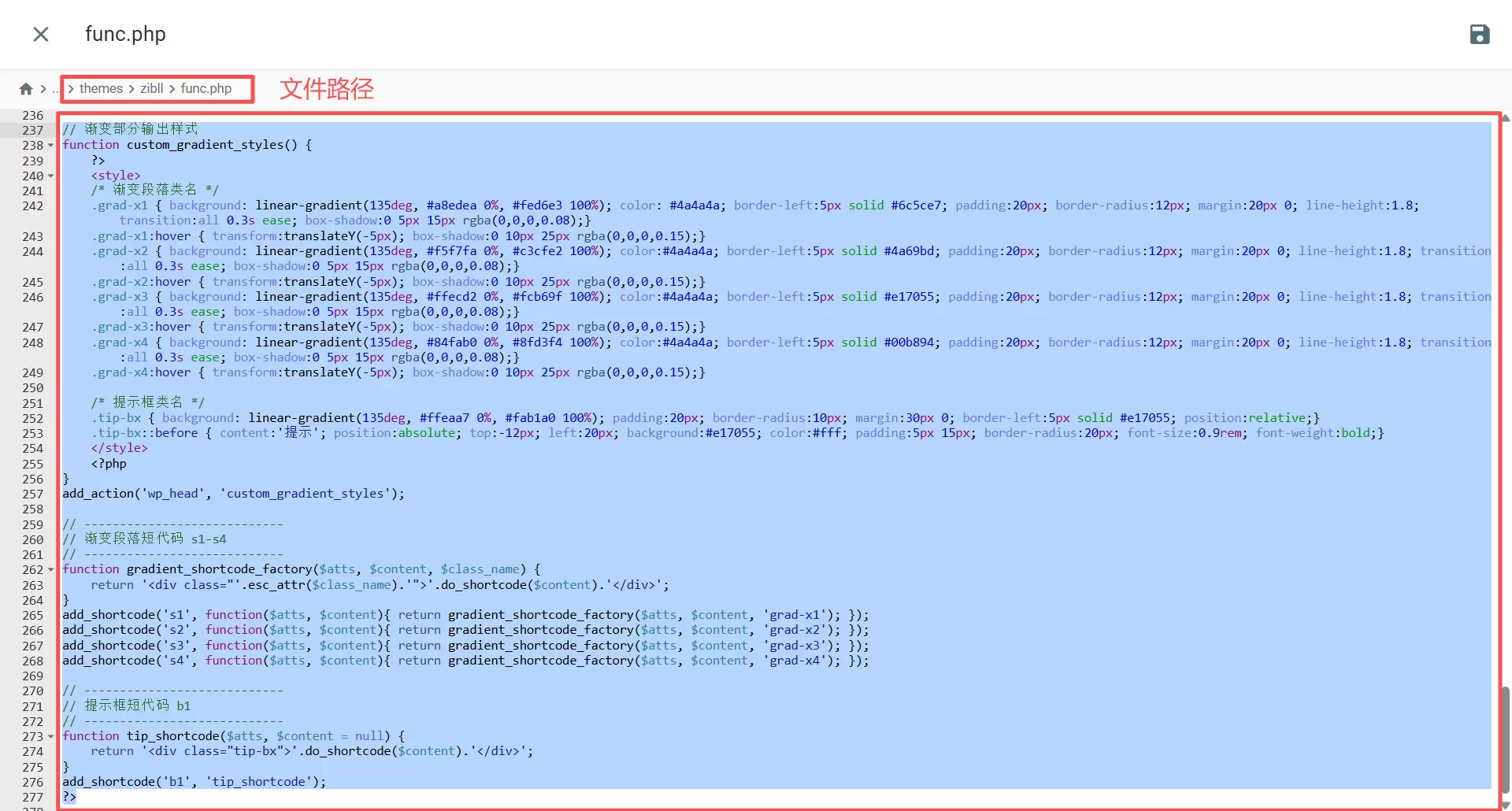
func.php代码如下放在最底部即可
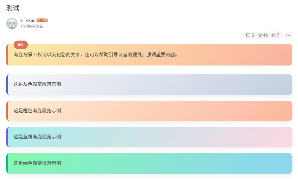 后台编辑直接替换短代码中间文字即可
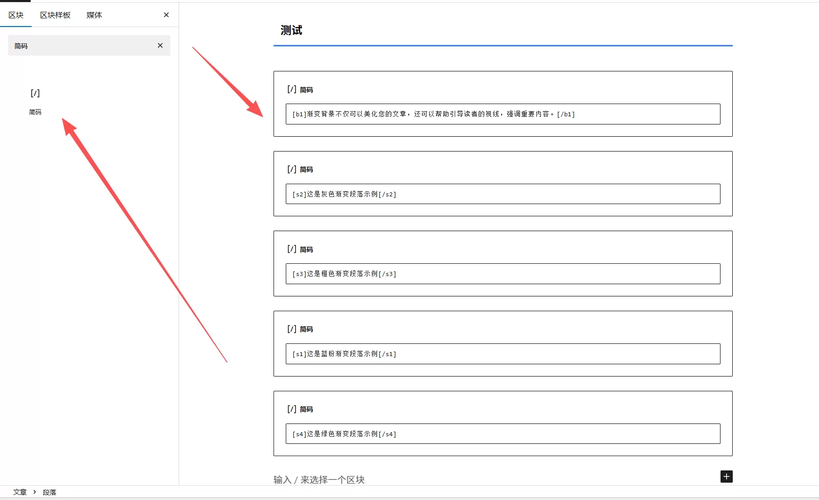 func.php代码如下放在最底部即可
// 渐变部分输出样式
function custom_gradient_styles() {
    ?>

    /* 渐变段落类名 */
    .grad-x1 { background: linear-gradient(135deg, #a8edea 0%, #fed6e3 100%); color: #4a4a4a; border-left:5px solid #6c5ce7; padding:20px; border-radius:12px; margin:20px 0; line-height:1.8; transition:all 0.3s ease; box-shadow:0 5px 15px rgba(0,0,0,0.08);}
    .grad-x1:hover { transform:translateY(-5px); box-shadow:0 10px 25px rgba(0,0,0,0.15);}
    .grad-x2 { background: linear-gradient(135deg, #f5f7fa 0%, #c3cfe2 100%); color:#4a4a4a; border-left:5px solid #4a69bd; padding:20px; border-radius:12px; margin:20px 0; line-height:1.8; transition:all 0.3s ease; box-shadow:0 5px 15px rgba(0,0,0,0.08);}
    .grad-x2:hover { transform:translateY(-5px); box-shadow:0 10px 25px rgba(0,0,0,0.15);}
    .grad-x3 { background: linear-gradient(135deg, #ffecd2 0%, #fcb69f 100%); color:#4a4a4a; border-left:5px solid #e17055; padding:20px; border-radius:12px; margin:20px 0; line-height:1.8; transition:all 0.3s ease; box-shadow:0 5px 15px rgba(0,0,0,0.08);}
    .grad-x3:hover { transform:translateY(-5px); box-shadow:0 10px 25px rgba(0,0,0,0.15);}
    .grad-x4 { background: linear-gradient(135deg, #84fab0 0%, #8fd3f4 100%); color:#4a4a4a; border-left:5px solid #00b894; padding:20px; border-radius:12px; margin:20px 0; line-height:1.8; transition:all 0.3s ease; box-shadow:0 5px 15px rgba(0,0,0,0.08);}
    .grad-x4:hover { transform:translateY(-5px); box-shadow:0 10px 25px rgba(0,0,0,0.15);}

    /* 提示框类名 */
    .tip-bx { background: linear-gradient(135deg, #ffeaa7 0%, #fab1a0 100%); padding:20px; border-radius:10px; margin:30px 0; border-left:5px solid #e17055; position:relative;}
    .tip-bx::before { content:'提示'; position:absolute; top:-12px; left:20px; background:#e17055; color:#fff; padding:5px 15px; border-radius:20px; font-size:0.9rem; font-weight:bold;}

    <?php
}
add_action('wp_head', 'custom_gradient_styles');

// ----------------------------
// 渐变段落短代码 s1-s4
// ----------------------------
function gradient_shortcode_factory($atts, $content, $class_name) {
    return ''.do_shortcode($content).'';
}
add_shortcode('s1', function($atts, $content){ return gradient_shortcode_factory($atts, $content, 'grad-x1'); });
add_shortcode('s2', function($atts, $content){ return gradient_shortcode_factory($atts, $content, 'grad-x2'); });
add_shortcode('s3', function($atts, $content){ return gradient_shortcode_factory($atts, $content, 'grad-x3'); });
add_shortcode('s4', function($atts, $content){ return gradient_shortcode_factory($atts, $content, 'grad-x4'); });

// ----------------------------
// 提示框短代码 b1
// ----------------------------
function tip_shortcode($atts, $content = null) {
    return ''.do_shortcode($content).'';
}
add_shortcode('b1', 'tip_shortcode');
?>



















1年前更新1089次阅读








2年前更新623次阅读





1年前发布373次阅读